Project Planning
We first started with secondary research from online sources. Some topics that we researched were
surrounding instrument care, library archiving, existing school equipment tracking tools, and instrument
rental and maintenance.
We also conducted some interviews with some people we knew who were involved with music and music
directing. I conducted 3 interviews with my Air Cadet friends who participated in the squadron band and
their school bands. Some of my interviewees were ensemble directors and others were section leads.
During the interviews, I used some pre-determined questions to guide the conversation and then asked
more insightful questions in response to the interviewees' answers.

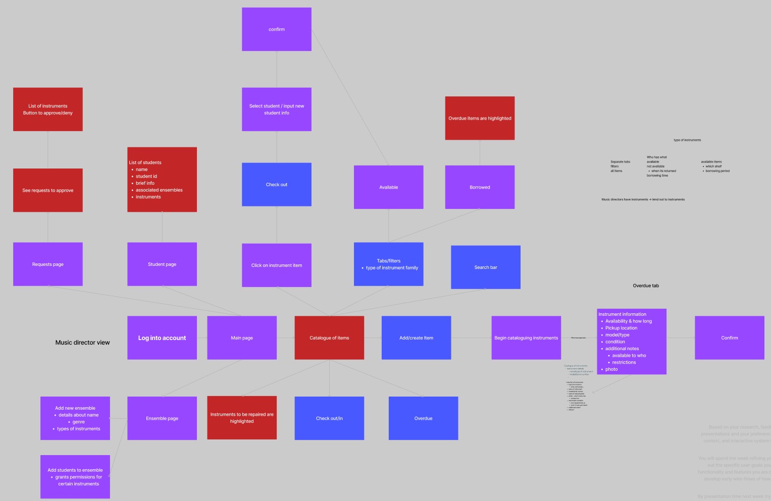
After determining the topic domain, issues, and similar existing apps, we began thinking of what screens
and processes the user would be going through while during the process of tracking instruments. This
includes cataloguing the instruments, assigning them and returning them from students, and the students
and ensembles currently in the school.
Initial Design
After determining the topic domain, issues, and similar existing apps, we began thinking of what screens
and processes the user would be going through while during the process of tracking instruments. This
includes cataloguing the instruments, assigning them and returning them from students, and the students
and ensembles currently in the school.

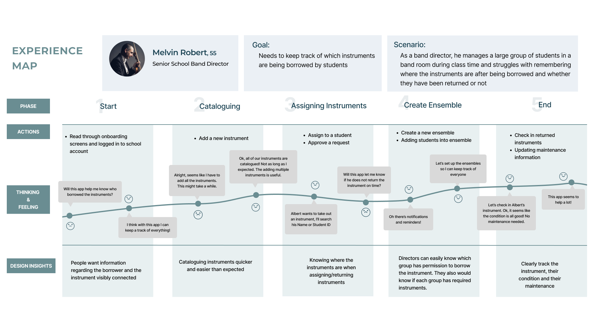
To further contextualize the issue, we also created a user experience map to analyse the thoughts and
opportunities throughout the different phases of the instrument tracking process.

During our first design proposal, we were given feedback that the app was somewhat boring and were asked
to find a way to make the cataloguing process quicker, instead of feeling like filling out a form. To
some extent, some of the information needed to keep track of the instrument could not be avoided, but we
thought of using solutions like using photos and computer vision to help expedite the process.

Design Iterations
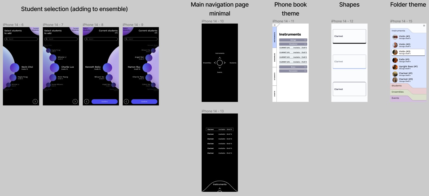
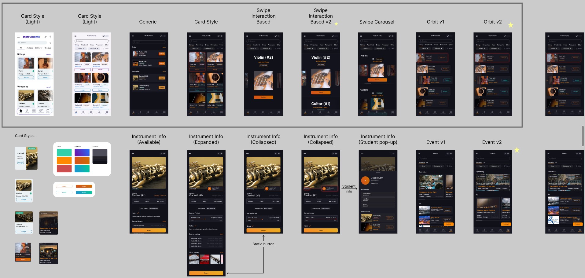
Based on feedback we recieved, I also designed some more experimental designs that broke away from our
initial design and were meant to
explore possible interactions in a more unconstrained way.

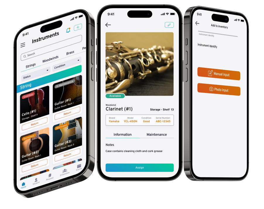
I also redesigned the instrument info pages to show the most relevant information at a glance without
requiring the user to scroll. Additionally, we decided to add in some events to the app where the music
directors could assign a groups or specific instruments to an event. I ended up making 3 variations of
the event page.

Refining
Throughout this process, we conducted user testing with friends to see how well the app worked. Some
issues our users encountered involved the onboarding process, cataloguing efficiency, returning,
assigning, and request process, and the events page. We then rethought and redesigned these processes to
alleviate those issues.
When users first open the app, it was blank because there are no instruments in the catalogue. As a
result, our users were left feeling lost and confused right from the start. To solve this, we created a
brief onboarding process with popups that indicate what the different buttons do and what process the
user should be going through to catalogue and assign or return instruments.
To fix the other issues, we focused how to better guide the user through the processes (cataloguing,
returning, assigning, requesting...). Some of these were resolved through better copy and blank state
instructions.
Results
This project was quite work intensive, requiring us to ideate the app concept, features, screens, all
while designing the interface and prototyping the interactions. I found that I enjoyed the process of
designing the visual interfaces the most fun, especially while creating some experimental iterations. It
was interesting getting feedback from the teaching team and thinking of solutions to make the experience
more streamlined and intuitive for the user. Although the final prototype did not turn out as polished
as I had initially hoped, I am still quite satisfied with the result of our project.
